 By Zetty Nemlowill/Marketing Director
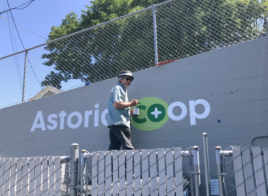
In our last newsletter I told you we’d be freshening up the co-op’s look and now… it’s official (see our new logo below)! We’re making this change now so that we will be ready to start designing our new store. We’re still the same co-op you know and love; we’re just getting better at sharing our story.

To survive and thrive, especially in a larger, more visible store, we need everyone to understand what makes Astoria Co+op different and why they might want to shop here. A logo and tag line can help represent this visually.
You’ll notice the subtle name change of “Astoria Co+op” instead of “Astoria Co-op Grocery.” The shorter name looks great, is very friendly and can be paired with our tagline (good. local. food.) It is simple and easy to understand at a glance.
The plus sign aligns our brand with the Co+op, stronger together brand and highlights our cooperative ownership. This allows us to fully utilize the resources available through our membership with National Co+op Grocers—Co+op Deals flyers, coupons, bags, coffee cups, and signs—while maintaining a cohesive visual identity with materials produced in-house.

I believe this change will result in an increase in efficiency, allowing us to mature into an even more competitive business, lowering operating costs while still treating our employees well.
While a new logo is an important symbol, it is our amazing staff, dedicated owners and shoppers, local farmers, delicious food, and being 100% community-owned that makes our co-op truly unique and special. Thank you for your continued support!